Showing posts with label Spring 2009. Show all posts

Thursday, June 25, 2009

project four: movie night!

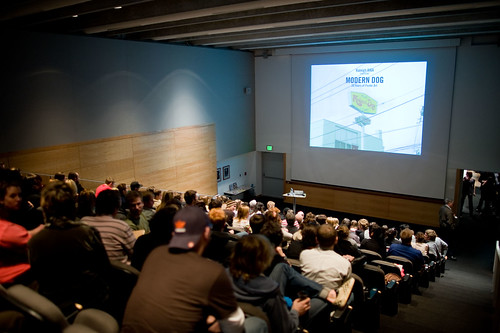
At the end of the project, Denise requested that we somehow string together all six of our moments into one "thing." Then we all gathered in Burns Auditorium (conveniently located next to our studio space), and had a screening night. It looked like this, but without the illustrious Modern Dog in attendance, and the audience was approximately 90% smaller.


(Image of Burns Auditorium from AIGA Raleigh's Flickr stream; the photo was taken during a lecture by Modern Dog hosted by the chapter at NCSU.)

Denise brought popcorn and other snacks, and we had a wonderful time. Many of my classmates put together very humorous takes of their moments, and it was fascinating to see what before had been very isolated and disparate moments, put together in different ways.

Here is what I showed that night:

Six Moments: Interface Moments Compilation... from Liese Zahabi on Vimeo.


I structured my compilation to save the stronger two pieces for the end, and because we were viewing this as an audience, I wanted to use some music (lest we all sit there in silence as my moments rolled by). I chose these two pieces by Yann Tiersen from the film Amelie...they capture the mood of my moments.

And, here is the promised reflection on my last three moments. For the first three, I purposefully kept my visual language abstract, and instead of having an A-HA moment and then making that vision, I tried to keep my ideas loose and malleable. For the most part, as I crafted those three interfaces, I had no idea where the visuals were going to go...a lot of it was trial and error.

I was very enamored with the idea of using the motivation of playful, and spent a lot of time thinking about different attributes of experience I could pair with it. When it came time to start making, instead of following my own lead and keeping things abstract and loose, I stumbled upon the idea of using a paper doll, and just could not let that go. Wrapped up in making a little world (three times over within the three different modes of media), I put my head down and didn't come up for air until the critique session.

Worst of all, instead of crafting three concise little moments, I created three sprawling monstrosities...three very involved and convoluted worlds, which I could not even satisfactorily explain to myself.

However, as much as I feel I "flopped" (wah-waah) on the end of this project, the flop has been very illuminating for me, bringing to light several flaws in my process and form making. I am still digesting and ruminating...and probably will be for quite a while.

project four: moment #6...

Again, the synopsis from my last post:

For this set of moments, we were to again, take a motivation and an attribute of experience and create an interactive moment. The twist this time, was to play that moment out within three different modes of interface. I chose to use the motivation of playful and the attribute of quirky. The three modes I chose were a single player game, a social application that would function within a chat program or Facebook, and a printed book/journal/paper doll set.

For this piece, I created a blank journal/paper doll set. Each spread contains an environment, a randomly generated quote which heads a page of blank lines, and a set of clothing items and accessories. The user is meant to read the quote, look at the environment and other elements, and then create a story, which they would then write on the page. Or not. I also intended for the journal to be a quirky puzzle, where the user is not quite sure what they are supposed to do (much like the single player game).

Playful + Quirky (Interface Moments: Moment #6) from Liese Zahabi on Vimeo.


And, again, I will discuss my reflections on these last three moments in the next post.

project four: moment #5...

Synopsis from my last post:

For this set of moments, we were to again, take a motivation and an attribute of experience and create an interactive moment. The twist this time, was to play that moment out within three different modes of interface. I chose to use the motivation of playful and the attribute of quirky. The three modes I chose were a single player game, a social application that would function within a chat program or Facebook, and a printed book/journal/paper doll set.

This represents the social application I created, using the same elements as the single player game. The idea for this application is that friends could create scenes using the Elp doll and the other elements (clothing, environments, accessories), and then also add a quote to accompany the scene. The application could also generate a random quote. The goal of the application is to create interesting juxtapositions and share them with your friends.

Playful + Quirky (Interface Moments: Moment #5) from Liese Zahabi on Vimeo.


Again, I will discuss my reflections about these last three moments in a later post.

project four: moment #4...

For this set of moments, we were to again, take a motivation and an attribute of experience and create an interactive moment. The twist this time, was to play that moment out within three different modes of interface. I chose to use the motivation of playful and the attribute of quirky. The three modes I chose were a single player game, a social application that would function within a chat program or Facebook, and a printed book/journal/paper doll set.

The idea for this first piece, was to create an interface in which the user has control over some of the elements of the scene, and in which they interact with Elp, the doll. But the user doesn't have control over everything. Elp often does unexpected things, or reacts unexpectedly to the elements around her. I wanted to create an interface in which things don't work quite the way you expected them to, and in which interesting juxtapositions could be created by the user.

Playful + Quirky (Interface Moments: Moment #4) from Liese Zahabi on Vimeo.


Again, I wanted to experiment with audio for this piece. All the vocalizations were done by me, with an additional sound effect used at the end. I wanted to illustrate a couple of different things about the interface in this demonstration. First, that the interface would conjure new objects for Elp to interact with based on the other elements in the scene. When Elp is given a fire and a sweater in the dark woods environment, she conjures up a marshmallow to roast. Second, I wanted to show how Elp would do something unexpected when presented with different objects. When she is given the lollipop, she completely changes the scene to something different (if not exceedingly cliché in hindsight).

I will comment on the outcome and my reflections about these last three moments in a later post.

project four: moments #2 and #3...

Here is the second part of the interface moments project. I chose the motivation of curiosity, and the attribute of experience of fragility to create these two moments. The beginning portion shows a rollover and then click for the elements. The second part of the movie shows how adding elements can change the behavior of the user. By adding fuzzy dots and a scoreboard, the behavior changes from one of curiosity to one of collection. The music is by Yann Tiersen from the soundtrack to the film Amelie.

Curiosity + Fragile (Interface Moments: Moments #2 and #3) from Liese Zahabi on Vimeo.


Again, I wanted to keep my visual language somewhat abstract. I used letterforms as objects of curiosity because they are inherently abstract symbols, and I thought making them fragile would be interesting.

project four: moment #1...

For the first moment, I chose the motivation to examine and the attribute of experience delicious. I really wanted to experiment with stop motion animation for this project, so I created a tableau and moved the elements around to achieve the effect of movement. I also wanted to remain somewhat abstract in my visual language. The word delicious is ripe with connotations—I did not want to simply use food or try to replicate something delicious. Instead I tried to pinpoint what delicious feels like, looks like, sounds like, and then attempt to express that visually. I chose vibrant colors, used interesting textures, and attempted to create a scene that was visceral.

To Examine + Delicious (Interface Moments: Moment #1) from Liese Zahabi on Vimeo.


I have also been experimenting with sound in my work, and knew I wanted that to be an element of this interface. Again, I wanted to remain somewhat abstract. So instead of creating the sounds of cooking or eating, I thought about what delicious might sound like. For me, the audible element of delicious is the "mmmmmm." So I hummed a song my mother used to sing to me.

project four: moments...

Here is the brief we worked with for project four…

Project 4
Design Six Dynamic Interface Moments

  1. Determine three motivations for a person to interact with an interface.
  2. Determine three different possible attributes of experience a person might have interacting with an interface.
  3. Using stop-frame animation, video, Flash, or mechanical means, combine a motivation with an experience in six different combinations.
  4. Design six interactive moments:
    1 interactive moment: Combine 1 motivation with 1 attribute of experience.
    2 interactive moments:
    Combine 1 motivation with 1 attribute of experience.
    Combine the same motivation with 1 attribute of experience that shifts the motivation.
    3 interactive moments:
    Respond to 1 motivation in 3 different designed environments.
    Maintain comparable attributes of experience across all Compilation of 6 interactive moments: Editing is advised. Movie day!
  5. The outcomes should afford user surprise, delight, and/or reflection.
Denise kept us on our toes for this project…she asked us to come up with a list of three motivations and three attributes of experience, but then only let us know how we would be implementing them one or two moments at a time. So as we were working on Moment #1, we had no idea how Moments #5 and #6 would play out. A very intriguing process.

The hardest part of this project was to remember that we were attempting to isolate and illustrate a moment, and not building an entire world full of interactions. This was very difficult for me, as you will see with my moments #4, #5 and #6. I tend to overcomplicate.

Overall, though, this project was extremely illuminating for me. The fact is, all design (especially that which involves motion and choice) is constructed of many moments, many details, many little elements. Striving to make these moments meaningful and consistent—while maintaining the overall "big picture"— is what design is all about.

Wednesday, June 3, 2009

project three: typography interface, take two...

So, after many more type experiments and much thought, here is my revised typography interface. I completely redid the interface in Flash, and wanted the piece to feel ambiguous and softly gritty (if that makes any sense).

Ambiguous Propensity: Take Two from Liese Zahabi on Vimeo.


The user comes to the site, and sees the grainy landscape of letters. A few of the letters beckon to the user by softly glowing with a color. As the user rolls over the letters, they shift slightly, almost as if you were running your hands through a pile of letters on a table. The colored letters are active, and to select one of the active letters, the user draws a circle around it.

Then the selected letter grows large (and beautifully pixelated and fuzzy), and one of the stanzas of the poem is released onto the landscape of that letter. I chose to use handwritten type to contrast with the universality (alleged) of the plastic helvetica letterforms. Once the stanza is released, the words pulse, letting the user know that they too are active. As the user rolls over these words, they fly away off the screen—the words that haven't been rolled over remain, and the user can then reposition these words to create new thoughts and sentences.

project three: typography interface, take one...

Here is my first stab at creating an interface using my plastic helvetica type. I decided to work in AfterEffects, which was a mistake, because the file size was enormous, and the project became very laborious. I had a difficult time making the application do exactly what I wanted (due to user error and ignorance, I'm sure), so this initial attempt is nowhere near where I wanted it to be.

I also struggled with timing, so the experience of the interface is much slower and plodding than I intended. Originally, there was an obnoxious sound track to accompany this piece (which consisted of my voice reading the text), but I decided to spare you, my blog audience, from having to listen to it.

Ambiguous Propensity: Take One from Liese Zahabi on Vimeo.


I love the way the space looks, the graininess of the light, the textures of the letterforms and the surface. But what happens within the space is not nearly as compelling as it could be. I spent a lot of time rethinking and reworking this project, which I will share with you in the next post.

an interlude with the beloved laser cutter...

I took some photographs of the laser cutter in action, and decided to string them together into a little movie. The music is Baby Elephant Walk by Henry Mancini, and there is a small cameo appearance by my classmate Tony Fugolo. Enjoy!

The Laser Cutter Dance from Liese Zahabi on Vimeo.

project three: typography as interface, take one...

After pondering my poem, I decided to experiment with the materiality of type (I also really wanted to play with the laser cutter here on campus). The notion of these experiments was to create type that had texture and weight and physical presence, and then place it in a digital environment and animate it—playing the two aspects against each other, physicality and digital-ness.

I experimented with thread and pins first:


Then I went through my collection of card stock and bought a huge piece of clear plexiglass and spent about four hours with the laser cutter:


These experiments with type were exhilarating and immensely enjoyable in their own right. I now own a pile of plastic helvetica letters, and there is something so awesome about that!

The next step in the project was to take these material attempts and somehow dump them into a digital environment, giving them motion and movement and to make it all compelling enough that a user would want to interact with it. A tall order indeed!

Friday, April 10, 2009

project three: writing content for a typographic interface...

And on to project number three...

Project 3
Design a Typographic Interface
  1. Free write in response to "interfaces for interfaces."
  2. Jumping off from a thought in the free writing, compose a text (fiction, essay, instruction manual, or other rhetorical form) about an experience with an interface.
  3. Read/perform the story in class accompanied by some typographic representation.
  4. Design an interface using only (1) your text; (2) its typographic embodiment; (3) any technological means.
  5. The outcome should employ visual rhetoric to augment the text.

I wrote a poem about the ambiguous nature of interface, which I then had the pleasure of "performing" in class:

Ambiguous Propensity
Just
tell me what to do.
How to be,
where to go
what to push or
pull
which seeds to sow,
when to leave.

Feel
for me—
see what I cannot
the thought or word or deed
arrayed.
Absurd
to depend
upon something so unlike me.
Composed of ones and zeros
frozen until dispatched.
Yet, I latch onto
you and your weird rhythm.

Anthropomorphized
prized—
detested.
I am completely invested
and rubbed raw.

Just
pluck out the beats
frenetic bleats and blips.
I twist my lips,
“Show me the way!”

Say
it plain—
entice and entreat
but don’t repeat yourself.
Don’t dwell or shill
or build it up too much.
Tell me something new.
Unknown, unbidden,
hidden from view.
Unwind it, bind it, bend it twain,
then rein me in
grin
and shove my nose in it.

Tower
shower over me
display your grandiosity
until I cower in the corner
like a child.

Just
guide me, lead me,
free me.
Oh! And make it
snappy.

The quality and range of the texts created by my classmates was amazing. The eleven of us wrote content that was personal, funny, witty, engaging, profound, exciting. I think the personal nature of the assignment helped everyone to loosen up a bit and let go.

The next part of the project was to create an interface using this text as content. However, Denise asked that we make the typography the thing that is acting as the interface. That we make it seen as type and not just as content.

Wednesday, March 25, 2009

project two: creating an interface for interfaces...

The next step in this (now becoming extremely complex) taxonomy project was to create a visual language and representation—to build an interface in which to access the taxonomy about navigation interfaces. (Yikes!)

Here is one of the interim attempts:


The logic behind this design is as follows:

• Each object was created using numbers, generated with a complex mathematical process (the average size for each object in the taxonomy was found; I then calculated the area or volume for each object in inches; next I calculated the square root of the area or volume; finally I took the first four digits after the decimal point of the square root and typed them out; and finally combined these typographical forms into the shapes you see here...phew!)

• Next the objects were extruded to give them a three dimensional feel. The shallow objects represent those that are the least tangible (these have also been made to be top-heavy in appearance); the deep objects represent those that are the most tangible (and therefore were made to be bottom-heavy).

• The objects are clustered and colorized by main category: GPS and Online Maps together in the front, Devices grouped together behind them, with Maps grouped together in the back. Teal objects are Maps (the lighter shade for maps that represent accurate distance, the darker shade for maps that represent non-accurate distance), gold objects are Devices (the lighter shade for devices that are electronic or digital, the darker shade for devices that are mechanical, and the red object is the GPS device which is a device and a map at the same time.

• Fences were constructed around the clusters of objects to represent ease of use—the tall impenetrable fence for the most difficult objects to use, the tiny corner stones in front for the easiest objects to use.

• Finally, to represent how portable the object is, I placed figures of monkeys atop each shape. The fewer monkeys on the shape, the more portable the object, the more monkeys the less portable.

Then after a few more iterations in look and feel, here is my final interface:

Interface for Interfaces: Navigation Interfaces... from Liese Zahabi on Vimeo.


Most of the visual language is the same, but the addition of pacing, time and interactivity helped simplify the initial look.

Overall, I wanted the user of this interface to have a sense of being lost, but not in a frightening or dire way. More the way one feels when traveling in a foreign city—it seems like things should make sense, but somehow they don't.

The user comes to the main screen, and has to look around to find the navigation hidden in the lower right. There are no labels or instructions, so the user chooses one of the icons. Then they are taken to a new (yet strangely the same) screen. As they explore the objects, they begin to click on them to find that some can be flicked off the screen. The objects that fly the farthest and fastest are the least tangible—those that simply rock and stay put are the most tangible.

Then the user navigates to another screen: this time all the objects are covered by clouds and fog. As the user rolls over the fog, some of it moves away. The fog represents ease of use—the objects easiest to use can be completely uncovered, those hardest to use remain obscured.

Finally, the user navigates to the last screen. Now as they click each object, it grows so the user can inspect it more closely and count the monkeys on top. The objects with the most monkeys are the least portable.

This project was indeed an arduous exercise in logic. However, the great benefit for me was to start out in a very regimented, rational frame of mind, and then attempt to abandon that frame and create something much more abstract and interesting. This was certainly very far out of my comfort zone, but the end result was both surprising and exciting for me. The push and pull and experiment in exploration has my mind spinning off in a million new directions. And working with interactivity and time (even in this very rudimentary way) was energizing and engaging. I'm looking forward to more work in this vein.

Sunday, March 15, 2009

project two: the mobile....

This was another attempt at visually representing my taxonomy. Each round shape represents one of the objects in the taxonomy, and were created using shrinkable plastic and transparency material. The mobile is organized around several different gradients of categorization, attempting to show multiple viewpoints at once.

  1. The map objects are represented by the transparency material; the device objects are represented by the shrinkable plastic.
  2. Portability is represented by the size of the circular shape.
  3. Tangibility is represented by the complexity of the pattern and graphics on each piece.
  4. Ease of use is represented by horizontal orientation.
  5. Updatability is represented by vertical orientation.


Much of the feedback I received during crit had to do with the fact that I chose to create a mobile in an attempt to give my taxonomy dimension and movement, but then fashioned it in a very static and flat way. Why didn't I consider the viewer, and the relationship between them and the mobile? Why didn't I attempt to create a more concrete third dimension of spatial relationships?

Representation of scale was also discussed: the smallest object within my taxonomy is a compass (which you can hold in your hand), while the largest is the size of a building. But the representation of this within my mobile makes it hard to understand the enormity of that scale. Creating a more expansive (and expressive) scale of size would have made the concept easier to understand, and would have possibly made the visuals more interesting.

Heads spinning and swimming with new possibilities, we all trudged back to the studio to attempt to make better sense of our content and categorization, and to figure out how to create a visually interesting interface to access it.

Thursday, February 19, 2009

project two: going mobile...

Because my genre of interface has everything to do with movement and location, I decided to try to create my taxonomy as a mobile. To do this I first had to tightly structure my categorization and items. In order to fully wrap my head around that, I created this concept map (my very first solo one!)


My final definition of navigation interfaces is: Objects, systems or devices which are used in the art or science of plotting, ascertaining, or directing a course of movement or action; which can be used to understand relationships of geographic concepts and qualities.

The items are categorized into Maps (further categorized into maps that are to geographic scale, and those that are not—the difference between a folded city map and a subway map in which all the routes are shown to express relationships rather than precise distance) and Devices (further categorized into mechanical devices and digital or electronic devices). You can use maps alone to plan trips or routes, navigate or locate, or to create connections and note relationships. Devices, however, must be used in conjunction with maps. My third category is the anomaly: the GPS device, which is both a device used for navigation and location which contains its own maps.

I have also indicated the different ways this information can be further explored or described: by portability, ease of use, tangibility (of materials and inner workings), and how updatable it is (paper maps are often out of date upon creation and can't be updated, while GPS devices are part of a system which is infinitely updatable.)

Wednesday, February 18, 2009

project two: taxonomy tango...

After much sweat, thought, research and categorizing, I carved out a beginning taxonomy for my genre of interface. In an attempt to give said taxonomy a visual form, I created the following artifacts:


We were asked to give our taxonomy some kind of visual form, and were asked to not just create a list, meaning that the information should spatially show relationships, values, gradients, etc. Although I attempted to spatially relate my information in a map, it was a failed experiment, and was dubbed "still a list". After our class crit, Denise asked us to all take another stab at this step, and refine our taxonomies and give them more interesting visual form.

From feedback I received at the crit, I decided to focus my explorations on geographic navigation (removing some of the less interesting content). I also decided I wanted to try to push myself out of my comfort zone and create a visualization of my taxonomy in an analog and 3D way.

project two: an interface for interfaces...

Our second project is now fully completed, so it's time for a recap.

First, the directive given by Denise:

Project 2
Design an Interface for Interfaces

  1. Select a genre of (designed) interface.
  2. Parse the genre into a taxonomy.
  3. Represent the taxonomy of the genre in some form.
  4. Design an interface for accessing the taxonomy.
  5. The outcome should foreground a point of view or commentary on the genre.

We took some time to decide on the genre of interface we wanted to work with, had a discussion about some of the different options, and began to further define interface (the definition is still in a pretty constant state of flux.) I decided to work with Navigation Interfaces (think GPS, online maps, atlases, navigation systems on websites).

Then we did another round of super-free-word-association-funtime on iChat. I created two compositions with the results from the prompts about my genre in an attempt to organize my thoughts.


From here we went off to define, parse, categorize and make sense of our genre of interfaces in the attempt of making a taxonomy.

rapid prototyping: aka whaaaaa?

A few weeks ago, as an exercise (given as a way to loosen us up, I believe) Denise took us through some free-word-association activities via iChat, which were great fun. We all sat at our computers in studio, all 12 of us crammed into one tiny chat room, all silently digitally hollering out answers at once. Paired with the real-time, real-life giggles and off-hand comments, it was a pretty surreal (but exciting) experience. The trigger questions to begin the word-association had to do with different genres of interface we had identified as a group at the beginning of class. For instance, "What if search tools....", and "What if video games.....?"After the word-association-mega-session was over, we each looked back over the iChat transcript and chose one of the responses to pair with our chosen genre.

I chose video games, and decided to focus on "What if video games held a grudge?"

Using this phrase as a prompt, we were asked to rapid prototype using several bags of junk we'd all brought in from home, which included: cardboard, paper scraps, glue sticks, 2 glue guns, dowel rods, pieces of wood, string, yarn, tape, bits and bobs, 2 bright pink NCSU mittens, a discarded calendar, broken toys and 3 tubes of glitter. We were given just 30 minutes to create something in response to our focus question. Here is my result:


We then took our prototypes into the auditorium next door, plopped them down on the first row of desks and held a critique. Denise pronounced us all "Designers" who were very much attempting to solve problems, and then asked us to repeat the exercise using the same prompt. However, this time, she wanted us to think about our response in a less literal way, and to really experiment with the materials at hand. My second attempt is far too sad and dismal to share even here, so I will spare you the visual. Suffice to say, I got caught up in playing with the paper hole punch and some cardboard, instead of pushing myself to do something interesting.

After a second critique, Denise asked us to go home and spend just an hour or so on a final response to our prompt, using any materials we liked. I created two versions:


This first attempt was created with a small box containing some plastic bits which I then wrapped with brightly colored ribbon, green yarn, and some brown cord. The yarn and cord were also knotted around the shape in some different patterns. My hope was to give the feeling of holding something or witholding something tightly. You could shake the shape, and tell that something was inside, but you just couldn't get to it.

The second object I made was certainly the most successful of the bunch:


In this final attempt, I used shrinkable plastic to create a more organic and alien feeling ball of witholding and holding back. I cut a small circle from the shrinkable plastic, and placed a bead on it and then melted/shrunk it in my toaster oven. I repeated that process several times with increasingly larger circles of plastic, always laying the plastic on the oven tray, and placing the previous ball on top of it. I was not able to fully control the process—the plastic flies up in this weird and alien way as it melts and shrinks, and it would grab hold of the ball atop it in different ways every time. Once the plastic had shrunk to a certain point, I would remove it, and press the edges around the ball until they cooled slightly, and repeat the process over again.

The result is this slick, bright white, shiny plastic ball that you want to just pull open, but you can't. Very odd and slightly disturbing even, which I think is an interesting response to the question "What if video games held a grudge?" No?

Tuesday, February 3, 2009

coffee mug interface: revisited...

So. After a few weeks of contemplation (and much needed distance), I want to present a refreshed take on this project.

But first, a few photos of the patterns I created....


So, after digesting things more, I have decided that in my (evolving) definition of interface, a coffee mug does not apply. When I applied a heat sensitive cling to the face of the mug, I was not intervening in an actual interface. However, by applying the cling to the mug, I was creating a new interface (in my ever evolving opinion).

Tuesday, January 20, 2009

coffee mug interface: envisioned...

But is it an interface? And moreover, is it a real intervention in the condition of contact?

Here is my submission, in all it's glory. First, a photo of the proposed object: a wrap placed on a travel coffee mug. The wrap is heat sensitive and changes it's pattern (like a chameleon) as the temperature of the coffee inside the mug changes, giving the user a visual cue to what's happening inside the mug.


I put together a video to illustrate how the patterns would change over time. (This video includes music...adjust your sound settings accordingly).


I built the patterns using typography (the digits of the temperatures of the coffee as it cools) because I wanted to explore the ways in which abstract patterns can be constructed to have a more narrative meaning—in this case, to tell the user the coffee is cooling. All the patterns are built with only the digits for the specified temperature and simple shapes filling in the negative space I created.

To strengthen the (tenuous, I know) narrative quality of the shifting patterns I also introduced scale, color and orientation shifts. The pattern begins with larger digits, a fiery color palette, and a very horizontal orientation. As the patterns signify a cooling of the coffee, the colors become more purple-y, the digits become smaller, and the pattern goes to plaid. The final iterations of the pattern have even smaller digits, an icy blue-gray color palette and have become vertical.

I was given much to think about and reassess during our crit session. Is this "interface" changing the condition of contact? Why did I choose a travel mug and then create an interface that isn't very useful while traveling? Why didn't I account for the pattern showing the amount of liquid inside the mug diminishing as the temperature cooled? Why not create something more concrete and entertaining (instead of just an abstract set of patterns)? Why a wrap? Why not just engineer the surface of an actual mug?

And the doozy, is the surface of a mug, or even the mug itself, an interface?

These are all questions I need to digest a bit longer before I respond.