• Could a filter be developed to visually show relevance? • Are there different ways an interface might display complex information without using hierarchical lists? • Can a designerly language feel authentic to an existing web forum community?
I wanted to examine the ways in which information can be delivered to a user, and the ways in which that user can interact with information. The three different kinds of elements within this interface enable users to reconfigure the information by large categories, forum members and specific food items. The user is also able to scroll through the landscape and turn filters on and off to privilege the different kinds of information.
By limiting viewing access to a small frame of the greater landscape, I am beginning to examine how interface can help a user prioritize and focus. I am also exploring different ways connections can be visualized within different kinds of information.
This is the final version of my filter for relevance. Each iteration has been exceptionally different from each other (especially the visual qualities), but the basic concept for each is actually very similar. In this version, I have created an interface entirely out of typography. The user comes to the site and is able to open a "drawer" to view the site content with a different lens. The user is able to navigate through the site content in a very different way, allowing for spatial/proximity relationships to be more evident, and enabling the user to explore and discover.
Please see my previous two posts for more information about this project.
This is my second attempt at creating a filter for relevance. This interface is an application housed within Facebook. The critique this was presented at was a silent one (we wandered around and viewed each other's work with no explication), so this presentation includes more visual explanation than I normally would have included.
How can a filter be designed to visually privilege relevance?
I decided to use the construct of a movie rental kiosk for my investigation. The system begins by asking the user for their three favorite movies. The system then creates a symbol to represent the user and create connections to all other movies.
In iteration #1, the amalgamated symbol generates a wireframe structure. Relevant categories and movies are located spatially upon the structure. The user would be able to interact with the structure and any information coming off of it to examine further.
In iteration #2, the categories and movies are arranged in space again, but this time relevance is shown by proximity to the user. Again, the user can interact with the information in a spatial way.
In iteration #3, the categories are arranged in a much more static way. This time relevance is shown by scale and use of the amalgamated symbol (color coded according to which favorite movie is most relevant.)
I still want to do more iterations and investigations, and want to build something out in flash to show how the interaction could start to work.
Propose and complete a design study that addresses an intersection (a point) rooted in (1) your thesis questions and (2) an aspect of the symposium theme "Design, Community and the Rhetoric of Authenticity."
The proposal/project will be:
Supported by precedents, textual and/or visual.
Pointed and specific.
Investigative of design issues.
Manifested in artifact(s).
Some of my initial ideas:
Points within my thesis
Understanding information
Making decisions about web/info
Shifting nature of attention
Triage
Making connections among points of information
Finding relevance (context)
Establishing credibility / critical thinking
Points within Symposium
Authentic experience
Real vs. faux
Vernacular of internet
Finding relevance (context)
Community making connections
Here is the visual brief I showed in class to discuss the tentative directions I wanted to move in:
Write a critical text responding to Project 2 results. Refer to your own approach and design outcome, of course, but also support your conclusions by referring to works done by other students, as well as published work you have found.
Following are a few of my observations/questions to fuel your inquiries.
• Overall, the initiations implicated designers (meaning you and me) as being severely entrenched in learned (a.k.a. "schooled") visual conventions strategies. Are these strategies tools? Handicaps? Assets?
• What, then, might be design's value to "communities", as compared to commercial interests? Is it our way of thinking? Our ability to isolate and present a concept clearly? The caché of "good design"?
• For the most part, the initiations did not expand (introduce new visual strategies) to the community visual language. Why is that? Were the visual conventions so conventional as to be unalterable? Did you, as a designer, feel you lacked permission to do so?
• What are your conventions for "successful design"? Is it impossible, advisable, desirable to move beyond them?
• Do you understand your design as having a rhetorical stance? What is it, and from whence does it originate?
Here is my text:
Manipulating visual conventions (really, conventions of any kind) is a tricky thing. Generally, these are established over time and agreed upon by communities or cultures. One cannot declare a convention for others with any certainty. Conventions are extremely fluid and mutable, and can be interpreted in very different ways. Because of this impermanence, manipulations of these conventions are experimental at best…designers serve as catalysts and can only predict an outcome (and are often surprised).
Our most recent MGD studio project asked us to identify and meddle with visual conventions for a specific community. I chose to examine an online community centered around food and cooking. My approach began with a deep dive into the community itself: How does it function? How do members relate to each other? How is communication achieved? What is important to the community? And finally, what does all that look like? This initial consideration of visual conventions resulted in a long but superficial list of typical online forum language: avatars, emoticons, navigation and bread crumbs, topic threads with nested comments, banner ads, etc. These are all indeed visual conventions this community engages with—many of which greatly influence the functionality and relationships of members—but none of them felt particular or specific to this online community.
Next I began to think about the visual conventions found in the act of cooking and engagement with food. This elicited ideas like measuring cups and spoons, food packaging, recipe cards, cookbooks, and mise en place (a French term meaning “everything in place”). This last convention felt very rich—I wondered if it could be used as a visual way to explain complex information to this community. Part of the assignment was to initiate something new. Members spend a lot of time on the site discussing the preparation, combination, taste and enjoyment of food—but what if they were asked to consider the nutritive content? Could the way they respond to and comprehend that information be affected by its visual language?
Using mise en place as a metaphor, I built out an image with bowls and dishes of varying shapes, colors and sizes to represent different categories of nutrition. I tried to use typography to represent the individual nutrition elements (fat, vitamin C, selenium)—applying transparency to each word and layering it within its respective dish. A fuller dish represented a greater percentage of that nutrient in the food. While this idea was compelling, in execution, the complexity of the visual language made it hard to understand the relationships between percentages and nutrients.
I discarded the specificity of the metaphor (literally, items in dishes) but retained the notion of parts to a whole, which is an integral part of cooking. My final design integrated this idea with the visual language of food packaging, cookbooks and recipe cards—culminating in an animated experience triggered when a community member views a recipe on the website. Nutrients are visually treated as products. A box for each nutrient falls into the browser frame—Fat, Carbohydrates, Protein, Sodium, Vitamin C . Each box displays the name of the “product” in typography reminiscent of processed food packaging—arched text, script fonts, bold letters, stroked type, and bright colors. Each box contains a grid of 100 small icons (a stick of butter for Fat, a package of steak for Protein, a salt shaker for Sodium), which represents the percent recommended for daily consumption. The amount contained within the current recipe is shown at full opacity, while the remaining icons on the grid are shown at a much lighter opacity—parts to a whole. The design is meant to be humorous and tongue-in-cheek. The community members love food and convey a sense of fun when they communicate with each other—I decided working with this would prove more compelling than working against it.
What felt most important in this exercise was to communicate with my chosen community in a way that would seem familiar to them, feel of them—but to also experiment with inventive “designerly” ways of doing that. This was much harder than I anticipated. How can a designer—with all her expert knowledge, jargon and prejudices regarding communication—step back and truly see the visual landscape through the eyes of a “non-expert”? Where is the line between imitation and condescension? How can the insertion of my voice as a designer compliment (and complement) that of the community? Users have definite expectations and nearly tangible comfort levels when they encounter artifacts—accounting for this and attempting to innovate within it was difficult. I struggled to clearly communicate my message while engaging the user in a memorable and emotional way.
Working in the medium of convention is something designers do every day—we weave them together and pick them apart and use them for desired effect (whether we consciously realize it or not). I believe conventions are both tools and limitations. We can employ them as shorthand to quickly gain comprehension, to suggest nuance, or even as subversion. At the same time, we always run the risk of misinterpreting how an intended audience will understand them. Convention is a blessing and a curse. Slippery, transient, nebulous—it is the very substance of society, communication, culture and humanity.
Please see my previous post to read the brief for this project.
After the feedback I received at crit, I began to develop an overlay to the DiscussCooking website, which would act as a hack the first time a user encountered it (forcing them to engage with it, either to explore further or to turn it off). My goal with this widget-interface is to introduce my community to the RDA (recommended daily allowance) nutrition information for the recipes on their site. Most of these recipes are user-contributed, and don't come with any specific information about nutrition. The tone of the website is fun and friendly overall, so I wanted to keep my initiation in line with that (and wanted to be somewhat tongue-in-cheek).
The user would come to the site, would navigate to a recipe, and the hack would take over (but only on initial discovery).
Once the hack has finished playing, the user may engage with it as they wish, and all the recipes that are part of the initiation are clearly marked with these interactive icons.
I didn't get much feedback during critique (I happened to go last, which I think didn't help). However, Denise asked us to reflect upon this project and write an analysis, which I will submit in my next post.
Here is the (very brief) brief Denise posted for project number 2...
Project 2 : An Initiation
1. Read : assigned sections on "discourse communities" from Shaping Information: the Rhetoric of Visual Conventions (Kostelnick and Hassett). (This and other reading reference posted here.) 2. Identify : existing visual conventions of the community you have selected to study in seminar. 3. Design : An Initiation to ________ , introducing new visual conventions that might logically follow, or interrupt, if such is the more compelling strategy. Any media, any point of delivery.
Again, my community for the semester is DiscussCooking.com.
After completing the reading assignment and analyzing the website my community uses, here are the visual conventions they favor:
Forum structure
Website navigation - Bread crumbs - Drop down menus - Multiple paths and options
Avatars
Signatures
Emoticons/Smileys
Buttons
Banner Ads
Side bars
Modularity
Search function
Logo (at top left)
Patterned background (checked tablecloth)
Icons
Photography - Of food - Of people - Of places
Calendar
This also made me think about the visual conventions people with an understanding of cooking would use:
Mise en place (everything in it's place)
Cookbooks
Recipes
Measuring systems (cups, spoons, etc.)
From here, I started to think about ideas for my initiation: What do I want to initiate this community into? I thought it could be interesting to somehow show the community how the food they discuss every day effects their body. Not necessarily for shock value...more for informative value. I wanted to approach this as a way to display unknown (or just non-considered) information in an interesting way.
Some initial brainstorms—could show:
How the body processes the food in a given recipe
Which organs are effected by the food in a given recipe
How quickly the body will metabolize the food in a given recipe
How the food in a given recipe breaks down into components that are processed differently by the body
Here is an initial sketch—my first idea for this project. I'm riffing off the idea of mise en place (french for everything in it's place), which is a technique chefs and cooks (and TV personalities) use when cooking. You prepare all the ingredients according to the recipe, measuring out everything into containers, arranging all the items by step or procedure within the recipe, before you start cooking.
I wondered if using mise en place as a metaphor could help users of this site understand nutrition information.
Feedback from the critique convinced me to move in a different direction. Denise thought I could push my idea in a more unexpected and surprising direction. I agree.
After the critique of our initial culture probes, Denise asked us to consider what the class had discussed—regarding the speculative success or failure of probes like these, but also the nature of ritual itself—and re-work our culture probe.
I wondered if changing my probe into something digital could drastically change the nature of the experience. Would a digital/animated experience be more engaging for Starbucks customers?
Here is a simulation of my proposed design. This would exist as a large square touch screen surface, hung on the large display wall in the seating area of my particular store. It would have a motion detector, allowing the interface to react to customers walking by. Users would be able to interact with the elements on the screen, and once engaged, would be asked to use the attached digital camera to take their own photo, caption it, and then look through photos taken by other customers all over the world.
Overall, I think both versions of my culture probe could prove illuminating. However, without actually testing it, I can only speculate about what might come out of it. The beauty of these types of probes (as discussed by Bill Gaver here) is that they can be used as tools by designers for inspiration. By amassing and curating "stuff" created by your customers/users/collaborators, you can sift through it and categorize it and play with it. The possibilities for recognizing patterns, shifts, new ideas and innovations are numerous. You just have to be open to it.
For our first official project, Denise assigned the following:
Project 1 : Anatomy of a Culture Probe
As you venture into "thick analysis", in studio we enlist your imagination to interpret and extrapolate from the explicit evidence you observe.
Based on observations culled at your coffee house:
Design a Culture Probe that aims to discover what/how/why ritual exists within the experience.
Speculate on the complete system that includes:
Format
Form
Verbiage/Tone
Locale
Moment
Delivery Mechanism
Respondent
Probe retrieval
Archiving
Assessment
Oy ve!
Nailing down a working definition of ritual seemed like a logical place to start, from dictionary.com:
Set of actions performed mainly for their symbolic value. (Not arbitrarily performed/chosen by performer, or dictated purely by logic, chance, necessity, etc.)
Any practice or pattern of behavior regularly performed in a set manner.
I also feel that ritual inherently has a sense of specialness or reverence…this is something set apart from every day operational action (although I believe that ritual can occur within the everyday).
Next I moved to some more online research and found some interesting articles about ritual. I discovered a conversation about the ritual-ness of the ways we use space—how we signal our defined space around us, signal power structures, and display identity through our use of space (i.e. in a workplace). This ritualistic use of space is certainly found in the context of the coffee shop. But how could I get at this notion with an artifact? How could I open up the user and encourage them to express some of their notions of space, and get them to define or label that?
The Idea To provide customers with an array of small, tactile objects and encourage them to arrange these objects in some way (with very little instruction or prompting). The customer would then be asked to frame their arrangement in a photograph (using a Polaroid camera) and label that photograph. Then the polaroids would be hung together on a wall in the seating area of the store.
The Specifics what's space got to do with it?
I was interested in the notion of space and the way it affects ritual (for example, issues of privacy, proximity, comfort, trust, freedom, etc.)
A way of getting at these ideas and perceptions is to engage the customers in a spatial way
I really wanted to think about a probe that was centered on creating conditions in which users could express themselves, or tell stories, or do something unexpected
SO my probe is a set of small somewhat abstract objects that the user would arrange in some way, frame in a polaroid photograph, label with a sharpy, and then hang in the coffee shop space.
so how does this thing work?
Three sets of objects would be placed in the customer seating area, 2 sets in labeled boxes, 1 set in a small glass container
A polaroid camera and some sharpies would also be accessible in the seating area
The labeled images would be hung on the back of the large merchandise wall, so all the photos could be viewed from the entrance of the store and the seating area
I really wanted the probe to be very open ended, I debated as to whether there would be explicit instructions included or not, and finally settled on having very brief directions that could still be somewhat ambiguous
I spent a lot of time debating what the arrangable objects should be: wanted them to be abstract but be able to have some symbolic meaning, wanted them to be tactile and have some presence (weight), wanted people to be able to stack and build if they wanted to
I tried to design this to not be from Starbucks, but still be of Starbucks
I wanted it to feel more like a store specific phenomenon
As to why people would participate, I hope by having these items on the tables (where normally just papers or computers are) people would be intrigued. They would also see all the photos on the wall and hopefully want to participate. Hopefully the unusual-ness of both the task and the use of the polaroid camera would be enticing.
and this is useful because...? The images could be collected after some duration (1–even 6 months) and then analyzed. The assessment would consist of looking for patterns, anomalies, ranges within the set of photographs.
Some questions that could be considered:
How did individuals respond to the materials and task?
How did individuals respond to the arrangements made by others?
How did individuals interpret space?
Where did they set up their arrangement?
How did they frame the photograph?
How did they consider scale? Color? Juxtaposition?
How does their written label correspond to their visual arrangement?
Did they define the arrangement with seriousness? Humor? Confusion? Irony?
How could designed artifacts fit into these spatial arrangements?
What do these arrangements say about the use of space? About drinking coffee?
The Execution Here is a presentation of my culture probe.
We were asked to choose a community to deeply investigate over the course of the semester. This was the first project involving that community. We were to observe and examine the community according to Dori Tunstall's five characteristics (mentioned in an earlier blog post—historic consciousness, life goals, organizational structures, relationships, and agency) and organize this information into a 25 slide (no more, no less) presentation. The presentation is meant to be stand-alone (meaning I shouldn't need to stand next to it verbally expanding for a viewer to understand).
Because the content/context of my thesis will be food, I chose Discuss Cooking (an online cooking community) for my investigation.
I enjoyed this deep dive… Examining the community along these structured guidelines forced me to look at it from perspectives I probably wouldn't have on my own. And this structure actually illuminated more subjective qualities about the community and members as well.
We will use this community throughout the semester for both seminar and studio projects—so you will see more of Discuss Cooking. I'm sure you are waiting with bated breath…
For our first Studio project, Denise assigned the following…
Project 1 : Anatomy of a Culture Probe
As you venture into "thick analysis", in studio we enlist your imagination to interpret and extrapolate from the explicit evidence you observe.
Based on observations culled at your coffee house:
Write a story from the perspective of a player in the experience, i.e. a particular customer, barista, dishwasher, busboy, manager, delivery person, etc.
She gave us this assignment before we made our observations, which made that exercise something of a "double-dip." While I was observing for my thick description, I was also very careful to capture moments and details that could be material for a piece of fiction.
I have never tried to write a short story, and decided that it would be interesting to make an attempt for this assignment. I tend to overcomplicate both my writing and my design, so for this project, I worked diligently to consider every sentence, phrase, word and comma, and omit anything that seemed superfluous.
I also decided to mix my process up a bit. I found a random number generator online, and generated two different numbers—one that corresponded to a page in my paperback dictionary, and one that corresponded to a word on that page. I used this word as an entry point into my story, and then ended up building upon that stylistically with other words from the same page.
I submit to you, my first short story.
Resplendent. He peered around the wall of merchandise carefully, hoping to see a corner of her face again. She was wearing pink today, with all that black and green, and it suited her. John was arguing with her about whether C-A-N was an abbreviation for "can" or "Canada." Frustration began to creep into her voice. He was sure her mouth was beginning to tense at the edges, thinning to sharp points as she bit off the ends of her words.
The chai tea was turning cold. He knew his presence in the tattered chair in the corner was growing conspicuous. How long had it been? He had forgotten his watch on the lamp-stand again. Forty-five minutes? Fifty?
He sighed a shade too loudly, and glanced down at his lap. Soft, supple fingers curled into a limp fist...skin tone foreign against his bright eggplant t-shirt. Why couldn't Carla have finished the laundry on time? The purple fabric was stretched tight against his paunch, and he noticed a small hole beginning to take shape near his navel. He must look ridiculous…an aging cartoon character of a man…the color of Barney the dinosaur. A groan of discomfort escaped him as he ran his hand over his bald spot…a nervous gesture he had established years ago.
The guy sitting at the next table—all dark hair and Run DMC t-shirt—glanced up and barely brushed his gaze across the space, immediately returning to his laptop universe.
"Hey, are you done with that paper?" Her eyes were dark slits against the sun streaming in behind him, flecks of gold flashing off the buttons on her hat. He choked on his spit, spilling chai tea onto the hem of her black pants. Four eyes turned down to the stain as it spread out over the top of her shoe, then slid back up to meet in the chilly space between them. Her lips were slightly parted, and she rolled her tongue to the side, tucking it into her cheek. Once, twice.
"Nice," she muttered under her breath as she floundered past him to the kitchen. Run DMC guy was staring at him now, a dark smirk teasing the corners of his mouth.
Resonant.
He manouvered himself up and out of the chair, and blindly threw his vestigial tea at the garbage can, missing it by nearly two feet. Tea and milk and cup and lid exploded against the wall, splattering the door, his cheek, the floor and the Run DMC t-shirt. He plowed forward, arms raised, windmills flying, and flung the door out and open—escape. He tucked his hands into his pockets, once, twice. Head ducked, quick steps toward the corner as he tried to slow his heart, measure out his breath, and somehow make it up the block.
He crossed the street and shook his head violently, making space for distraction.
Carla would have finished the laundry by now. He could rescue his Harvard t-shirt from the warmth of the dryer and walk up to the library. Ellen would be working today, her pale skin incandescent behind her oversized glasses, widely framing moist brown eyes. If he hurried he could catch her on her way to lunch, subtly brushing past her on the stone staircase. There would be books and chairs—crevices to peer out of, objects to hide behind.
Resuscitate.
Overall, I am pleased with this. It was an extremely valuable exercise for me, and I think the end result is a decent character study. One of my goals for the semester is to practice more restraint within my work. To ruthlessly edit and re-frame my ideas, allowing more space for simplicity and resonance. Hopefully, this is a step in the right direction.
We are focusing on the concept of community (and the ways we can get at culture through that lens) in both studio and seminar this semester. To do this, we are using a framework of qualities about community put forth by Dori Tunstall (design anthropologist). She posits that a community displays/contains the following five characteristics (in varying degrees):
• Historic consciousness — an understanding of where the community comes from • Life goals—the things and values that really matter to the community • Organizational structures—how decisions are made, how the community is arranged, and how members fit into that • Relationships—the ways in which people connect and communicate and create understanding and trust • Agency—the degree of control (or influence) an individual has within the community
We have also discussed the discipline of ethnography, and the ways in which designers can use the techniques of that discipline to engage and study specific communities. A thick description is something created by an ethnographer (or someone acting as one)—a detailed, rich and expansive description of people, actions, behaviors, objects, environments and other "stuff" observed in a culture.
Our first assignment was to observe the culture within one of the local coffee shops in Raleigh and create our own thick description. We are working in teams of four or five to bring together the observations of several people into one macro-description. I chose to observe Starbucks, and my team decided to make our observations at different times on different days. I went on a Saturday just after lunch, ordered an iced coffee, found a plush chair in one corner, and spent the next hour and a half scribbling furiously in my notebook, trying not to look too conspicuous.
It was fascinating (truly) to sit in a commercial space and just watch people (people watching is something I enjoy doing all the time) but this had a different quality to it, a more pointed purpose, a depth that regular people watching doesn't have.
After the observations were all finished, my small group came together and wove our separate descriptions together, looking for patterns, anomalies and points of interest. Rehashing and combining what we had observed led to insights and opinions we wouldn't have made through the initial observation.
Ultimately, what this assignment revealed is that observing people in an environment can lead to compelling information not easily garnered through a questionnaire or focus group. By carefully observing the ways people interact with objects, environments, products and each other, designers can look for the points of mediation within a complete experience and begin to see how design can slip into those points.
This semester we are talking about Design as a cultural experience. At the outset, I have many personal questions about the construct of culture...
How are artifacts read and understood (or not)? What are the cultural constructions societies agree on (or not)? Where is the place that design slips into the cracks of a culture? Or is it laid atop everything in multiple layers and overlapping levels? Can there truly be commonalities? How many people constitute a culture? How can cultures shift and change over time—how transient are they? Where does the notion of tradition rub up against culture—creating sparks of resistance and conflict? How does design shape culture—and of course, how does culture shape design?
Many directions and avenues to examine and explore. It will be interesting to see where the conversation takes us....
And here it begins. Thesis. That six-letter word that we all knew loomed in our futures....but it almost seems inconceivable that the process has begun.
The amazing thing about the thesis journey at NCSU is that not only is there a tried-and-true system and method for us to follow, but we are being guided by Meredith Davis as we travel along the path. We met with her, back in May, directly following our final review (the day after)—and she attempted to prepare us to make the best use of our summer.
We were to read and skim through books that interested us. Make sure to look to the left and right of the books that interested us. To follow threads and make note of what caught our eye. We were to poke our heads up out of the design landscape and scan other disciplines and subjects for connections and ideas.
We were to make lists as well. A list of these topics and interests. A list of the ways we like to work. And a list of where we want to be after all of this is finished, degree in hand. I was impressed and excited to hear that all three of these lists would be taken into consideration when we crafted our researchable question in the fall.
So, here we are, a month into the semester, and these lists have evolved into questions. Big questions, sub-questions, partial-questions, awkward questions, redundant questions, and questions about the questions. My head is swirling with all these queries, and still foggy about exactly what it is I want to ask.
Here is what I do know: • I am firstly interested in information science and how it relates to graphic design • I am interested in the state of information overload/anxiety many people feel • I am also interested in a process called "information triage," which is how people sort, prioritize and make connections within the flood of information they encounter • I know I want to work with digital/online material—this is certainly where I feel the most overwhelmed by information • And I know I want the context of my thesis to be food—I believe this will afford a great deal of options and directions for possible "info-triage," and it's a topic I know something about and in which I would love to learn more
So, this is where I am...Meredith seems satisfied with my general direction. However, I'm still struggling to write that perfect researchable question, and find those relevant and pointed sub-questions to fall beneath it. I will keep you posted...
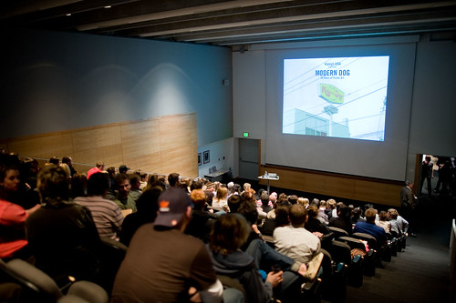
At the end of the project, Denise requested that we somehow string together all six of our moments into one "thing." Then we all gathered in Burns Auditorium (conveniently located next to our studio space), and had a screening night. It looked like this, but without the illustrious Modern Dog in attendance, and the audience was approximately 90% smaller.
(Image of Burns Auditorium from AIGA Raleigh's Flickr stream; the photo was taken during a lecture by Modern Dog hosted by the chapter at NCSU.)
Denise brought popcorn and other snacks, and we had a wonderful time. Many of my classmates put together very humorous takes of their moments, and it was fascinating to see what before had been very isolated and disparate moments, put together in different ways.
I structured my compilation to save the stronger two pieces for the end, and because we were viewing this as an audience, I wanted to use some music (lest we all sit there in silence as my moments rolled by). I chose these two pieces by YannTiersen from the film Amelie...they capture the mood of my moments.
And, here is the promised reflection on my last three moments. For the first three, I purposefully kept my visual language abstract, and instead of having an A-HA moment and then making that vision, I tried to keep my ideas loose and malleable. For the most part, as I crafted those three interfaces, I had no idea where the visuals were going to go...a lot of it was trial and error.
I was very enamored with the idea of using the motivation of playful, and spent a lot of time thinking about different attributes of experience I could pair with it. When it came time to start making, instead of following my own lead and keeping things abstract and loose, I stumbled upon the idea of using a paper doll, and just could not let that go. Wrapped up in making a little world (three times over within the three different modes of media), I put my head down and didn't come up for air until the critique session.
Worst of all, instead of crafting three concise little moments, I created three sprawling monstrosities...three very involved and convoluted worlds, which I could not even satisfactorily explain to myself.
However, as much as I feel I "flopped" (wah-waah) on the end of this project, the flop has been very illuminating for me, bringing to light several flaws in my process and form making. I am still digesting and ruminating...and probably will be for quite a while.
For this set of moments, we were to again, take a motivation and an attribute of experience and create an interactive moment. The twist this time, was to play that moment out within three different modes of interface. I chose to use the motivation of playful and the attribute of quirky. The three modes I chose were a single player game, a social application that would function within a chat program or Facebook, and a printed book/journal/paper doll set.
For this piece, I created a blank journal/paper doll set. Each spread contains an environment, a randomly generated quote which heads a page of blank lines, and a set of clothing items and accessories. The user is meant to read the quote, look at the environment and other elements, and then create a story, which they would then write on the page. Or not. I also intended for the journal to be a quirky puzzle, where the user is not quite sure what they are supposed to do (much like the single player game).
For this set of moments, we were to again, take a motivation and an attribute of experience and create an interactive moment. The twist this time, was to play that moment out within three different modes of interface. I chose to use the motivation of playful and the attribute of quirky. The three modes I chose were a single player game, a social application that would function within a chat program or Facebook, and a printed book/journal/paper doll set.
This represents the social application I created, using the same elements as the single player game. The idea for this application is that friends could create scenes using the Elp doll and the other elements (clothing, environments, accessories), and then also add a quote to accompany the scene. The application could also generate a random quote. The goal of the application is to create interesting juxtapositions and share them with your friends.
For this set of moments, we were to again, take a motivation and an attribute of experience and create an interactive moment. The twist this time, was to play that moment out within three different modes of interface. I chose to use the motivation of playful and the attribute of quirky. The three modes I chose were a single player game, a social application that would function within a chat program or Facebook, and a printed book/journal/paper doll set.
The idea for this first piece, was to create an interface in which the user has control over some of the elements of the scene, and in which they interact with Elp, the doll. But the user doesn't have control over everything. Elp often does unexpected things, or reacts unexpectedly to the elements around her. I wanted to create an interface in which things don't work quite the way you expected them to, and in which interesting juxtapositions could be created by the user.
Again, I wanted to experiment with audio for this piece. All the vocalizations were done by me, with an additional sound effect used at the end. I wanted to illustrate a couple of different things about the interface in this demonstration. First, that the interface would conjure new objects for Elp to interact with based on the other elements in the scene. When Elp is given a fire and a sweater in the dark woods environment, she conjures up a marshmallow to roast. Second, I wanted to show how Elp would do something unexpected when presented with different objects. When she is given the lollipop, she completely changes the scene to something different (if not exceedingly cliché in hindsight).
I will comment on the outcome and my reflections about these last three moments in a later post.
Here is the second part of the interface moments project. I chose the motivation of curiosity, and the attribute of experience of fragility to create these two moments. The beginning portion shows a rollover and then click for the elements. The second part of the movie shows how adding elements can change the behavior of the user. By adding fuzzy dots and a scoreboard, the behavior changes from one of curiosity to one of collection. The music is by Yann Tiersen from the soundtrack to the film Amelie.
Again, I wanted to keep my visual language somewhat abstract. I used letterforms as objects of curiosity because they are inherently abstract symbols, and I thought making them fragile would be interesting.
For the first moment, I chose the motivation to examine and the attribute of experience delicious. I really wanted to experiment with stop motion animation for this project, so I created a tableau and moved the elements around to achieve the effect of movement. I also wanted to remain somewhat abstract in my visual language. The word delicious is ripe with connotations—I did not want to simply use food or try to replicate something delicious. Instead I tried to pinpoint what delicious feels like, looks like, sounds like, and then attempt to express that visually. I chose vibrant colors, used interesting textures, and attempted to create a scene that was visceral.
I have also been experimenting with sound in my work, and knew I wanted that to be an element of this interface. Again, I wanted to remain somewhat abstract. So instead of creating the sounds of cooking or eating, I thought about what delicious might sound like. For me, the audible element of delicious is the "mmmmmm." So I hummed a song my mother used to sing to me.
Here is the brief we worked with for project four…
Project 4 Design Six Dynamic Interface Moments
Determine three motivations for a person to interact with an interface.
Determine three different possible attributes of experience a person might have interacting with an interface.
Using stop-frame animation, video, Flash, or mechanical means, combine a motivation with an experience in six different combinations.
Design six interactive moments: 1 interactive moment: Combine 1 motivation with 1 attribute of experience. 2 interactive moments: Combine 1 motivation with 1 attribute of experience. Combine the same motivation with 1 attribute of experience that shifts the motivation. 3 interactive moments: Respond to 1 motivation in 3 different designed environments. Maintain comparable attributes of experience across all Compilation of 6 interactive moments: Editing is advised. Movie day!
The outcomes should afford user surprise, delight, and/or reflection.
Denise kept us on our toes for this project…she asked us to come up with a list of three motivations and three attributes of experience, but then only let us know how we would be implementing them one or two moments at a time. So as we were working on Moment #1, we had no idea how Moments #5 and #6 would play out. A very intriguing process.
The hardest part of this project was to remember that we were attempting to isolate and illustrate a moment, and not building an entire world full of interactions. This was very difficult for me, as you will see with my moments #4, #5 and #6. I tend to overcomplicate.
Overall, though, this project was extremely illuminating for me. The fact is, all design (especially that which involves motion and choice) is constructed of many moments, many details, many little elements. Striving to make these moments meaningful and consistent—while maintaining the overall "big picture"— is what design is all about.
So, after many more type experiments and much thought, here is my revised typography interface. I completely redid the interface in Flash, and wanted the piece to feel ambiguous and softly gritty (if that makes any sense).
The user comes to the site, and sees the grainy landscape of letters. A few of the letters beckon to the user by softly glowing with a color. As the user rolls over the letters, they shift slightly, almost as if you were running your hands through a pile of letters on a table. The colored letters are active, and to select one of the active letters, the user draws a circle around it.
Then the selected letter grows large (and beautifully pixelated and fuzzy), and one of the stanzas of the poem is released onto the landscape of that letter. I chose to use handwritten type to contrast with the universality (alleged) of the plastic helvetica letterforms. Once the stanza is released, the words pulse, letting the user know that they too are active. As the user rolls over these words, they fly away off the screen—the words that haven't been rolled over remain, and the user can then reposition these words to create new thoughts and sentences.
Here is my first stab at creating an interface using my plastic helvetica type. I decided to work in AfterEffects, which was a mistake, because the file size was enormous, and the project became very laborious. I had a difficult time making the application do exactly what I wanted (due to user error and ignorance, I'm sure), so this initial attempt is nowhere near where I wanted it to be.
I also struggled with timing, so the experience of the interface is much slower and plodding than I intended. Originally, there was an obnoxious sound track to accompany this piece (which consisted of my voice reading the text), but I decided to spare you, my blog audience, from having to listen to it.
I love the way the space looks, the graininess of the light, the textures of the letterforms and the surface. But what happens within the space is not nearly as compelling as it could be. I spent a lot of time rethinking and reworking this project, which I will share with you in the next post.
I took some photographs of the laser cutter in action, and decided to string them together into a little movie. The music is Baby Elephant Walk by Henry Mancini, and there is a small cameo appearance by my classmate Tony Fugolo. Enjoy!
After pondering my poem, I decided to experiment with the materiality of type (I also really wanted to play with the laser cutter here on campus). The notion of these experiments was to create type that had texture and weight and physical presence, and then place it in a digital environment and animate it—playing the two aspects against each other, physicality and digital-ness.
I experimented with thread and pins first:
Then I went through my collection of card stock and bought a huge piece of clear plexiglass and spent about four hours with the laser cutter:
These experiments with type were exhilarating and immensely enjoyable in their own right. I now own a pile of plastic helvetica letters, and there is something so awesome about that!
The next step in the project was to take these material attempts and somehow dump them into a digital environment, giving them motion and movement and to make it all compelling enough that a user would want to interact with it. A tall order indeed!
Free write in response to "interfaces for interfaces."
Jumping off from a thought in the free writing, compose a text (fiction, essay, instruction manual, or other rhetorical form) about an experience with an interface.
Read/perform the story in class accompanied by some typographic representation.
Design an interface using only (1) your text; (2) its typographic embodiment; (3) any technological means.
The outcome should employ visual rhetoricto augment the text.
I wrote a poem about the ambiguous nature of interface, which I then had the pleasure of "performing" in class: Ambiguous Propensity
Just tell me what to do. How to be, where to go what to push or pull which seeds to sow, when to leave.
Feel for me— see what I cannot the thought or word or deed arrayed. Absurd to depend upon something so unlike me. Composed of ones and zeros frozen until dispatched. Yet, I latch onto you and your weird rhythm.
Anthropomorphized prized— detested. I am completely invested and rubbed raw.
Just pluck out the beats frenetic bleats and blips. I twist my lips, “Show me the way!”
Say it plain— entice and entreat but don’t repeat yourself. Don’t dwell or shill or build it up too much. Tell me something new. Unknown, unbidden, hidden from view. Unwind it, bind it, bend it twain, then rein me in grin and shove my nose in it.
Tower shower over me display your grandiosity until I cower in the corner like a child.
Just guide me, lead me, free me. Oh! And make it snappy.
The quality and range of the texts created by my classmates was amazing. The eleven of us wrote content that was personal, funny, witty, engaging, profound, exciting. I think the personal nature of the assignment helped everyone to loosen up a bit and let go.
The next part of the project was to create an interface using this text as content. However, Denise asked that we make the typography the thing that is acting as the interface. That we make it seen as type and not just as content.
The next step in this (now becoming extremely complex) taxonomy project was to create a visual language and representation—to build an interface in which to access the taxonomy about navigation interfaces. (Yikes!)
Here is one of the interim attempts:
The logic behind this design is as follows:
• Each object was created using numbers, generated with a complex mathematical process (the average size for each object in the taxonomy was found; I then calculated the area or volume for each object in inches; next I calculated the square root of the area or volume; finally I took the first four digits after the decimal point of the square root and typed them out; and finally combined these typographical forms into the shapes you see here...phew!)
• Next the objects were extruded to give them a three dimensional feel. The shallow objects represent those that are the least tangible (these have also been made to be top-heavy in appearance); the deep objects represent those that are the most tangible (and therefore were made to be bottom-heavy).
• The objects are clustered and colorized by main category: GPS and Online Maps together in the front, Devices grouped together behind them, with Maps grouped together in the back. Teal objects are Maps (the lighter shade for maps that represent accurate distance, the darker shade for maps that represent non-accurate distance), gold objects are Devices (the lighter shade for devices that are electronic or digital, the darker shade for devices that are mechanical, and the red object is the GPS device which is a device and a map at the same time.
• Fences were constructed around the clusters of objects to represent ease of use—the tall impenetrable fence for the most difficult objects to use, the tiny corner stones in front for the easiest objects to use.
• Finally, to represent how portable the object is, I placed figures of monkeys atop each shape. The fewer monkeys on the shape, the more portable the object, the more monkeys the less portable.
Then after a few more iterations in look and feel, here is my final interface:
Most of the visual language is the same, but the addition of pacing, time and interactivity helped simplify the initial look.
Overall, I wanted the user of this interface to have a sense of being lost, but not in a frightening or dire way. More the way one feels when traveling in a foreign city—it seems like things should make sense, but somehow they don't.
The user comes to the main screen, and has to look around to find the navigation hidden in the lower right. There are no labels or instructions, so the user chooses one of the icons. Then they are taken to a new (yet strangely the same) screen. As they explore the objects, they begin to click on them to find that some can be flicked off the screen. The objects that fly the farthest and fastest are the least tangible—those that simply rock and stay put are the most tangible.
Then the user navigates to another screen: this time all the objects are covered by clouds and fog. As the user rolls over the fog, some of it moves away. The fog represents ease of use—the objects easiest to use can be completely uncovered, those hardest to use remain obscured.
Finally, the user navigates to the last screen. Now as they click each object, it grows so the user can inspect it more closely and count the monkeys on top. The objects with the most monkeys are the least portable.
This project was indeed an arduous exercise in logic. However, the great benefit for me was to start out in a very regimented, rational frame of mind, and then attempt to abandon that frame and create something much more abstract and interesting. This was certainly very far out of my comfort zone, but the end result was both surprising and exciting for me. The push and pull and experiment in exploration has my mind spinning off in a million new directions. And working with interactivity and time (even in this very rudimentary way) was energizing and engaging. I'm looking forward to more work in this vein.
This was another attempt at visually representing my taxonomy. Each round shape represents one of the objects in the taxonomy, and were created using shrinkable plastic and transparency material. The mobile is organized around several different gradients of categorization, attempting to show multiple viewpoints at once.
The map objects are represented by the transparency material; the device objects are represented by the shrinkable plastic.
Portability is represented by the size of the circular shape.
Tangibility is represented by the complexity of the pattern and graphics on each piece.
Ease of use is represented by horizontal orientation.
Updatability is represented by vertical orientation.
Much of the feedback I received during crit had to do with the fact that I chose to create a mobile in an attempt to give my taxonomy dimension and movement, but then fashioned it in a very static and flat way. Why didn't I consider the viewer, and the relationship between them and the mobile? Why didn't I attempt to create a more concrete third dimension of spatial relationships?
Representation of scale was also discussed: the smallest object within my taxonomy is a compass (which you can hold in your hand), while the largest is the size of a building. But the representation of this within my mobile makes it hard to understand the enormity of that scale. Creating a more expansive (and expressive) scale of size would have made the concept easier to understand, and would have possibly made the visuals more interesting.
Heads spinning and swimming with new possibilities, we all trudged back to the studio to attempt to make better sense of our content and categorization, and to figure out how to create a visually interesting interface to access it.
Because my genre of interface has everything to do with movement and location, I decided to try to create my taxonomy as a mobile. To do this I first had to tightly structure my categorization and items. In order to fully wrap my head around that, I created this concept map (my very first solo one!)
My final definition of navigation interfaces is: Objects, systems or devices which are used in the art or science of plotting, ascertaining, or directing a course of movement or action; which can be used to understand relationships of geographic concepts and qualities.
The items are categorized into Maps (further categorized into maps that are to geographic scale, and those that are not—the difference between a folded city map and a subway map in which all the routes are shown to express relationships rather than precise distance) and Devices (further categorized into mechanical devices and digital or electronic devices). You can use maps alone to plan trips or routes, navigate or locate, or to create connections and note relationships. Devices, however, must be used in conjunction with maps. My third category is the anomaly: the GPS device, which is both a device used for navigation and location which contains its own maps.
I have also indicated the different ways this information can be further explored or described: by portability, ease of use, tangibility (of materials and inner workings), and how updatable it is (paper maps are often out of date upon creation and can't be updated, while GPS devices are part of a system which is infinitely updatable.)
After much sweat, thought, research and categorizing, I carved out a beginning taxonomy for my genre of interface. In an attempt to give said taxonomy a visual form, I created the following artifacts:
We were asked to give our taxonomy some kind of visual form, and were asked to not just create a list, meaning that the information should spatially show relationships, values, gradients, etc. Although I attempted to spatially relate my information in a map, it was a failed experiment, and was dubbed "still a list". After our class crit, Denise asked us to all take another stab at this step, and refine our taxonomies and give them more interesting visual form.
From feedback I received at the crit, I decided to focus my explorations on geographic navigation (removing some of the less interesting content). I also decided I wanted to try to push myself out of my comfort zone and create a visualization of my taxonomy in an analog and 3D way.
The outcome should foreground a point of view or commentary on the genre.
We took some time to decide on the genre of interface we wanted to work with, had a discussion about some of the different options, and began to further define interface (the definition is still in a pretty constant state of flux.) I decided to work with Navigation Interfaces (think GPS, online maps, atlases, navigation systems on websites).
Then we did another round of super-free-word-association-funtime on iChat. I created two compositions with the results from the prompts about my genre in an attempt to organize my thoughts.
From here we went off to define, parse, categorize and make sense of our genre of interfaces in the attempt of making a taxonomy.