Showing posts with label Interface. Show all posts

Monday, February 8, 2010

thesis: visual study #2 A…

So, without further ado, here is my first visual study. (It is #2, because it corresponds to my second sub-question, even though it is the first study I'm attempting.)

Some details:
This is housed within a browser as a standalone program (like Viewzi). I have been thinking about this as a system that allows the user to click, and drag and drop items and objects within the interface. This would be to enable the user to sort and clump information.

The interface has three different special modes: saved material, tagging & sharing, and filtering.

Thesis: Visual Study #2: Take one.... from Liese Zahabi on Vimeo.


Saved material mode:
  • Users can drag pages they want to save to this space, where the information and websites can be sorted by different criteria: time, hierarchy, tag relevance, etc.
  • Users can also drag results off the edge of the frame to throw away pages they don't want.
  • The system recognizes which pages are already saved and thrown away, so these don't show up in future searches.
  • This space serves to hold material and allow users to sort through it as needed.
  • The drawer can be pulled out further, giving the user a larger space to sort upon.
  • Information still "being considered" is pooled together in the bottom corner in a small blob, which can be fanned out as needed by clicking on it.

Tagging & sharing mode:
  • This functions as a way to apply tags on the fly (and to organize them).
  • The user can also view how other people have tagged information.
  • The results window displays which tags have been applied to the current search information.

Filtering mode:
  • This is meant to function in a very flexible way—the way in which people create associations for materials and truly categorize them can be quite unique. So this mode would be very robust and flexible.
  • Users can filter by: source type, category, time, popularity, etc. (This is just the beginning of the kinds of categories and filters that could be created/generated by both the system, other users, and the current user).
I will post an analysis of this study soon.

Monday, October 26, 2009

project #3: a filter for relevance—attempt #1...

My main thesis question is:

How can the design of an online information triage system support users in managing information and making decisions about nutrition?

My point of intersection between thesis and our symposium is:

Relevance (and triage, authenticity, credibility, trust, critical thinking, filtering)

My investigation for project #3:

How can a filter be designed to visually privilege relevance?

I decided to use the construct of a movie rental kiosk for my investigation. The system begins by asking the user for their three favorite movies. The system then creates a symbol to represent the user and create connections to all other movies.

Here are my investigative iterations....

Relevence Filter: Iterations... from Liese Zahabi on Vimeo.


In iteration #1, the amalgamated symbol generates a wireframe structure. Relevant categories and movies are located spatially upon the structure. The user would be able to interact with the structure and any information coming off of it to examine further.

In iteration #2, the categories and movies are arranged in space again, but this time relevance is shown by proximity to the user. Again, the user can interact with the information in a spatial way.

In iteration #3, the categories are arranged in a much more static way. This time relevance is shown by scale and use of the amalgamated symbol (color coded according to which favorite movie is most relevant.)

I still want to do more iterations and investigations, and want to build something out in flash to show how the interaction could start to work.

Monday, October 19, 2009

project #2: a community initiation...

Please see my previous post to read the brief for this project.

After the feedback I received at crit, I began to develop an overlay to the DiscussCooking website, which would act as a hack the first time a user encountered it (forcing them to engage with it, either to explore further or to turn it off). My goal with this widget-interface is to introduce my community to the RDA (recommended daily allowance) nutrition information for the recipes on their site. Most of these recipes are user-contributed, and don't come with any specific information about nutrition. The tone of the website is fun and friendly overall, so I wanted to keep my initiation in line with that (and wanted to be somewhat tongue-in-cheek).

The user would come to the site, would navigate to a recipe, and the hack would take over (but only on initial discovery).

A Community Initiation... from Liese Zahabi on Vimeo.


Once the hack has finished playing, the user may engage with it as they wish, and all the recipes that are part of the initiation are clearly marked with these interactive icons.


I didn't get much feedback during critique (I happened to go last, which I think didn't help). However, Denise asked us to reflect upon this project and write an analysis, which I will submit in my next post.

Thursday, June 25, 2009

project four: movie night!

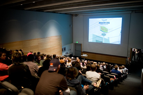
At the end of the project, Denise requested that we somehow string together all six of our moments into one "thing." Then we all gathered in Burns Auditorium (conveniently located next to our studio space), and had a screening night. It looked like this, but without the illustrious Modern Dog in attendance, and the audience was approximately 90% smaller.


(Image of Burns Auditorium from AIGA Raleigh's Flickr stream; the photo was taken during a lecture by Modern Dog hosted by the chapter at NCSU.)

Denise brought popcorn and other snacks, and we had a wonderful time. Many of my classmates put together very humorous takes of their moments, and it was fascinating to see what before had been very isolated and disparate moments, put together in different ways.

Here is what I showed that night:

Six Moments: Interface Moments Compilation... from Liese Zahabi on Vimeo.


I structured my compilation to save the stronger two pieces for the end, and because we were viewing this as an audience, I wanted to use some music (lest we all sit there in silence as my moments rolled by). I chose these two pieces by Yann Tiersen from the film Amelie...they capture the mood of my moments.

And, here is the promised reflection on my last three moments. For the first three, I purposefully kept my visual language abstract, and instead of having an A-HA moment and then making that vision, I tried to keep my ideas loose and malleable. For the most part, as I crafted those three interfaces, I had no idea where the visuals were going to go...a lot of it was trial and error.

I was very enamored with the idea of using the motivation of playful, and spent a lot of time thinking about different attributes of experience I could pair with it. When it came time to start making, instead of following my own lead and keeping things abstract and loose, I stumbled upon the idea of using a paper doll, and just could not let that go. Wrapped up in making a little world (three times over within the three different modes of media), I put my head down and didn't come up for air until the critique session.

Worst of all, instead of crafting three concise little moments, I created three sprawling monstrosities...three very involved and convoluted worlds, which I could not even satisfactorily explain to myself.

However, as much as I feel I "flopped" (wah-waah) on the end of this project, the flop has been very illuminating for me, bringing to light several flaws in my process and form making. I am still digesting and ruminating...and probably will be for quite a while.

project four: moment #6...

Again, the synopsis from my last post:

For this set of moments, we were to again, take a motivation and an attribute of experience and create an interactive moment. The twist this time, was to play that moment out within three different modes of interface. I chose to use the motivation of playful and the attribute of quirky. The three modes I chose were a single player game, a social application that would function within a chat program or Facebook, and a printed book/journal/paper doll set.

For this piece, I created a blank journal/paper doll set. Each spread contains an environment, a randomly generated quote which heads a page of blank lines, and a set of clothing items and accessories. The user is meant to read the quote, look at the environment and other elements, and then create a story, which they would then write on the page. Or not. I also intended for the journal to be a quirky puzzle, where the user is not quite sure what they are supposed to do (much like the single player game).

Playful + Quirky (Interface Moments: Moment #6) from Liese Zahabi on Vimeo.


And, again, I will discuss my reflections on these last three moments in the next post.

project four: moment #5...

Synopsis from my last post:

For this set of moments, we were to again, take a motivation and an attribute of experience and create an interactive moment. The twist this time, was to play that moment out within three different modes of interface. I chose to use the motivation of playful and the attribute of quirky. The three modes I chose were a single player game, a social application that would function within a chat program or Facebook, and a printed book/journal/paper doll set.

This represents the social application I created, using the same elements as the single player game. The idea for this application is that friends could create scenes using the Elp doll and the other elements (clothing, environments, accessories), and then also add a quote to accompany the scene. The application could also generate a random quote. The goal of the application is to create interesting juxtapositions and share them with your friends.

Playful + Quirky (Interface Moments: Moment #5) from Liese Zahabi on Vimeo.


Again, I will discuss my reflections about these last three moments in a later post.

project four: moment #4...

For this set of moments, we were to again, take a motivation and an attribute of experience and create an interactive moment. The twist this time, was to play that moment out within three different modes of interface. I chose to use the motivation of playful and the attribute of quirky. The three modes I chose were a single player game, a social application that would function within a chat program or Facebook, and a printed book/journal/paper doll set.

The idea for this first piece, was to create an interface in which the user has control over some of the elements of the scene, and in which they interact with Elp, the doll. But the user doesn't have control over everything. Elp often does unexpected things, or reacts unexpectedly to the elements around her. I wanted to create an interface in which things don't work quite the way you expected them to, and in which interesting juxtapositions could be created by the user.

Playful + Quirky (Interface Moments: Moment #4) from Liese Zahabi on Vimeo.


Again, I wanted to experiment with audio for this piece. All the vocalizations were done by me, with an additional sound effect used at the end. I wanted to illustrate a couple of different things about the interface in this demonstration. First, that the interface would conjure new objects for Elp to interact with based on the other elements in the scene. When Elp is given a fire and a sweater in the dark woods environment, she conjures up a marshmallow to roast. Second, I wanted to show how Elp would do something unexpected when presented with different objects. When she is given the lollipop, she completely changes the scene to something different (if not exceedingly cliché in hindsight).

I will comment on the outcome and my reflections about these last three moments in a later post.

project four: moments #2 and #3...

Here is the second part of the interface moments project. I chose the motivation of curiosity, and the attribute of experience of fragility to create these two moments. The beginning portion shows a rollover and then click for the elements. The second part of the movie shows how adding elements can change the behavior of the user. By adding fuzzy dots and a scoreboard, the behavior changes from one of curiosity to one of collection. The music is by Yann Tiersen from the soundtrack to the film Amelie.

Curiosity + Fragile (Interface Moments: Moments #2 and #3) from Liese Zahabi on Vimeo.


Again, I wanted to keep my visual language somewhat abstract. I used letterforms as objects of curiosity because they are inherently abstract symbols, and I thought making them fragile would be interesting.

project four: moment #1...

For the first moment, I chose the motivation to examine and the attribute of experience delicious. I really wanted to experiment with stop motion animation for this project, so I created a tableau and moved the elements around to achieve the effect of movement. I also wanted to remain somewhat abstract in my visual language. The word delicious is ripe with connotations—I did not want to simply use food or try to replicate something delicious. Instead I tried to pinpoint what delicious feels like, looks like, sounds like, and then attempt to express that visually. I chose vibrant colors, used interesting textures, and attempted to create a scene that was visceral.

To Examine + Delicious (Interface Moments: Moment #1) from Liese Zahabi on Vimeo.


I have also been experimenting with sound in my work, and knew I wanted that to be an element of this interface. Again, I wanted to remain somewhat abstract. So instead of creating the sounds of cooking or eating, I thought about what delicious might sound like. For me, the audible element of delicious is the "mmmmmm." So I hummed a song my mother used to sing to me.

project four: moments...

Here is the brief we worked with for project four…

Project 4
Design Six Dynamic Interface Moments

  1. Determine three motivations for a person to interact with an interface.
  2. Determine three different possible attributes of experience a person might have interacting with an interface.
  3. Using stop-frame animation, video, Flash, or mechanical means, combine a motivation with an experience in six different combinations.
  4. Design six interactive moments:
    1 interactive moment: Combine 1 motivation with 1 attribute of experience.
    2 interactive moments:
    Combine 1 motivation with 1 attribute of experience.
    Combine the same motivation with 1 attribute of experience that shifts the motivation.
    3 interactive moments:
    Respond to 1 motivation in 3 different designed environments.
    Maintain comparable attributes of experience across all Compilation of 6 interactive moments: Editing is advised. Movie day!
  5. The outcomes should afford user surprise, delight, and/or reflection.
Denise kept us on our toes for this project…she asked us to come up with a list of three motivations and three attributes of experience, but then only let us know how we would be implementing them one or two moments at a time. So as we were working on Moment #1, we had no idea how Moments #5 and #6 would play out. A very intriguing process.

The hardest part of this project was to remember that we were attempting to isolate and illustrate a moment, and not building an entire world full of interactions. This was very difficult for me, as you will see with my moments #4, #5 and #6. I tend to overcomplicate.

Overall, though, this project was extremely illuminating for me. The fact is, all design (especially that which involves motion and choice) is constructed of many moments, many details, many little elements. Striving to make these moments meaningful and consistent—while maintaining the overall "big picture"— is what design is all about.

Wednesday, June 3, 2009

project three: typography interface, take one...

Here is my first stab at creating an interface using my plastic helvetica type. I decided to work in AfterEffects, which was a mistake, because the file size was enormous, and the project became very laborious. I had a difficult time making the application do exactly what I wanted (due to user error and ignorance, I'm sure), so this initial attempt is nowhere near where I wanted it to be.

I also struggled with timing, so the experience of the interface is much slower and plodding than I intended. Originally, there was an obnoxious sound track to accompany this piece (which consisted of my voice reading the text), but I decided to spare you, my blog audience, from having to listen to it.

Ambiguous Propensity: Take One from Liese Zahabi on Vimeo.


I love the way the space looks, the graininess of the light, the textures of the letterforms and the surface. But what happens within the space is not nearly as compelling as it could be. I spent a lot of time rethinking and reworking this project, which I will share with you in the next post.

project three: typography as interface, take one...

After pondering my poem, I decided to experiment with the materiality of type (I also really wanted to play with the laser cutter here on campus). The notion of these experiments was to create type that had texture and weight and physical presence, and then place it in a digital environment and animate it—playing the two aspects against each other, physicality and digital-ness.

I experimented with thread and pins first:


Then I went through my collection of card stock and bought a huge piece of clear plexiglass and spent about four hours with the laser cutter:


These experiments with type were exhilarating and immensely enjoyable in their own right. I now own a pile of plastic helvetica letters, and there is something so awesome about that!

The next step in the project was to take these material attempts and somehow dump them into a digital environment, giving them motion and movement and to make it all compelling enough that a user would want to interact with it. A tall order indeed!

Tuesday, February 3, 2009

coffee mug interface: revisited...

So. After a few weeks of contemplation (and much needed distance), I want to present a refreshed take on this project.

But first, a few photos of the patterns I created....


So, after digesting things more, I have decided that in my (evolving) definition of interface, a coffee mug does not apply. When I applied a heat sensitive cling to the face of the mug, I was not intervening in an actual interface. However, by applying the cling to the mug, I was creating a new interface (in my ever evolving opinion).

Tuesday, January 20, 2009

coffee mug interface: envisioned...

But is it an interface? And moreover, is it a real intervention in the condition of contact?

Here is my submission, in all it's glory. First, a photo of the proposed object: a wrap placed on a travel coffee mug. The wrap is heat sensitive and changes it's pattern (like a chameleon) as the temperature of the coffee inside the mug changes, giving the user a visual cue to what's happening inside the mug.


I put together a video to illustrate how the patterns would change over time. (This video includes music...adjust your sound settings accordingly).


I built the patterns using typography (the digits of the temperatures of the coffee as it cools) because I wanted to explore the ways in which abstract patterns can be constructed to have a more narrative meaning—in this case, to tell the user the coffee is cooling. All the patterns are built with only the digits for the specified temperature and simple shapes filling in the negative space I created.

To strengthen the (tenuous, I know) narrative quality of the shifting patterns I also introduced scale, color and orientation shifts. The pattern begins with larger digits, a fiery color palette, and a very horizontal orientation. As the patterns signify a cooling of the coffee, the colors become more purple-y, the digits become smaller, and the pattern goes to plaid. The final iterations of the pattern have even smaller digits, an icy blue-gray color palette and have become vertical.

I was given much to think about and reassess during our crit session. Is this "interface" changing the condition of contact? Why did I choose a travel mug and then create an interface that isn't very useful while traveling? Why didn't I account for the pattern showing the amount of liquid inside the mug diminishing as the temperature cooled? Why not create something more concrete and entertaining (instead of just an abstract set of patterns)? Why a wrap? Why not just engineer the surface of an actual mug?

And the doozy, is the surface of a mug, or even the mug itself, an interface?

These are all questions I need to digest a bit longer before I respond.

Sunday, January 11, 2009

coffee, tea, or me?

Coffee. Coffee in the morning. The metal travel mug between me and my coffee in the morning. The lack of an interface between me and my coffee in the morning.

These are the things keeping me awake at night lately.

I have a deliciously ritualistic (and let's face it, religious) relationship with my coffee. I can't live without it. Simply cannot function without the precious. And when I say ritualistic, I really do mean it. I make it exactly the same way (with slight variations in brand, and sometimes additives like cinnamon dumped directly into the filter) every.single.morning.

I go to the kitchen, open the pantry door, grab the open bag of coffee (and I always finish one bag before I open the next...no cheating!), open the cupboard next to the pantry and grab the black plastic Gevalia measuring spoon I keep with my spices (why? I don't know, I just do, so there!). Then I turn to the counter where I keep the blessed pot, open her up, pull out the full and spent filter from yesterday morning, throw it in the trash, and replace it with a shiny new one. I rinse the pot out with water, fill to the almost 6 cup mark, and fill up the reservoir. I measure out 5 rounded Gevalia spoons of coffee, dump them into the filter, and let the maker rip. (Sometimes, I use whole bean coffee instead of ground, but I'm sure you understand where that difference would fit in).

It's the same. The same every morning. The same motions, the same positions, the same actions and behaviors. But really, that's just the routine. Just my normal, workaday, slightly OCD routine.

The ritual, the religion, comes in the reverence and the waiting. Once I've added the Splenda to my travel coffee mug, the coffee, and the splash of milk, I twist the top on, and then I wait. During the wait, I will probably drive to school, walk to the studio, and turn my computer on. Maybe I'll chat with a classmate or two. All this time, I've still not had a sip. Not one sip. Because I'm waiting. This is the ritual. And this is why...

I hate hot coffee. There, I said it. My secret is out. It burns my poor little mouth and I hate it. I also hate cold coffee (not iced coffee, of course, because in the summertime, iced coffee is a little slice of heaven, but, it's supposed to be cold then). Cold coffee (completely cooled coffee) is disgusting. And lukewarm coffee is not much better than cold coffee, really.

But warmish-hottish coffee...now there's your gold. When it's not really steaming anymore, but if you look really hard it still is, sorta. That's the best. Then you pick up the mug, inhale the aroma, and take that long delicious sip. Man. And it warms your mouth, your throat, your insides all the way down into your gut. And you can't wait to take that next sip. But you do, you wait so you can prolong the ritual. Because it feels that special, that precious. You want it to go on forever.

And here is the crux of the issue: if you wait too long before you start your sipping, if you miss the cues and don't catch the coffee right as it hits that delightful warmish-hottish stage, then before you can finish your mug, the coffee has gone cold and gross and ick! And then you drink it anyway (don't want to be wasteful, and face it, you need the caffeine), but it's not the same. The ritual has been replaced by gross cold coffee, and you cry inside a little bit.

I am going to fix this. Well, I'm going to attempt to fix it. My studio explorations, for this, our first and warm-up project, will be to alter the interface of the metal travel coffee mug, to change it and thus change the experience someone has with it. I want to create a set of visual (and hopefully delightful, joyful, stimulating and interesting) cues that live on the outside of that mug that will intuitively inform you of how hot your coffee is at any given moment.

For now, I envision this as a heat sensitive wrap, applied on the outside of the mug. The wrap will have the ability to display many different visual images or patterns or some sort of aesthetic cues which will intuitively correspond to different temperatures. I want to do this in a delightful and engaging way. So that the interface will not purely be about the temperature of the coffee, but also about the fun of watching it cool down. Of catching the mug at just the right change in the interface. Of learning at which point in the visual cues that is, and of learning when the people around you enjoy their coffee most. So people will comment on each other's mugs with snappy, clever jokes. "Hurry up, Sarah, your coffee's going plaid!"

I need to do a LOT of exploration of pattern and texture and image to see if the idea has any merit. But at the outset, I feel it really does, and that the process of creating a pattern or image for my beloved warmish-hottish, will, at the very least, be interesting and engaging (and probably at least a little infuriating). I'll keep you posted.
let's face it: we're interfacing...

What a monumental subject to tackle right out of the gate. Interface. What is an interface? What does it encompass? What does it suggest? What does it think about? Who are it's favorite authors? Is it lonely? Is it tired?

What does my first source for definitions (the handy dandy hand-held dictionary, of course) have to say for itself?

Interface: 1) a plane forming the common boundary between two parts of matter or space 2) a point or means of interaction between two systems, groups, etc. vt., vl. faced, facing: to interact with (another system, group, etc.)

This holds true to what I left our last studio session with: interface is what lies between two things. It's the screen/pixels/browser window that lies between you and the inner workings of your computer. It's the pane of glass that lies between your body and the world outside your home. It's the travel coffee mug that lies between you and your precious, precious coffee in the morning.

It's the membrane, the surface, the skin, the (sometimes) intangible that is betwixt and between and often unseen or unknown (sometimes, by design). It is what unites and divides, enables and hinders, delights and confounds: and it seems that the goal for so long has been to make it seamless (and maybe seemless) and nearly invisible and un-noticeable.

But why couldn't designers and developers sometimes strive to make an interface that was in your face? Delightful and unexpected and so lush and interesting that the act of interacting would be full of joy and wonder? That could make for an interface worth writing home to mama about?